Microsoft
Skype call experience
A total overhaul to deliver a modern, unified audio and video calling experience for Skype on all platforms
ROLE
Lead designer (interaction, visual, motion)
UX research
Information architecture
Prototyping
DOMAIN
Desktop, web and mobile
Consumer audio and video calling
Consumer > small/medium business communication tools
Growth & experimentation design
IMPACT
Restored trust in Skype as simple and easy to use communication app (increased app store rating, stabilized engagement)
Delivered a scaleable call IA with new functionality and room to experiment and grow
WORK > SKYPE CALL EXPERIENCE
Context
Skype had been seeing a gradual decline in engagement as competitors more offered more compelling experiences to do the same job.
While Skype had established a very strong reputation as an easy to use, reliable but somewhat utilitarian calling/chat app, the business was slow to innovate and keep up with new richer and more fun offerings from services more integrated with popular social media networks.
Skype had been traditionally been built natively for every platform, which afforded excellent performance and AV quality - but also required 4-5 times as much time and effort to develop and maintain.
How would Skype remain relevant?
Classic Skype experience
Competition (e.g. Facebook messenger)
What happened next…
A new unified app was built in React, with a radical new design driven by new leadership and an external design agency, intended to reinvent the product and brand to appeal to a new customer base.
In addition to the significant departure in terms of aesthetics and styling, several new features (e.g. in-call reactions and photo gallery sharing) were introduced.
Notably, gestures (swipe between activities, tap to toggle contextual controls) were heavily pushed in favor of traditional UI controls.
Reactions!
Existing users felt alienated by the dramatic change and more importantly they found the new experience frustrating and difficult to use.
Skype was not attracting new users, while losing loyal customers.
Redesign the redesign
Iteration 1 goals:
Delicately & rapidly improve usability to address feedback and customer complaints.
Establish a simple, but scaleable information architecture that accommodated business needs to grow and experiment with new features to increase engagement.
Iteration 1
Early sketches:
Iteration 1
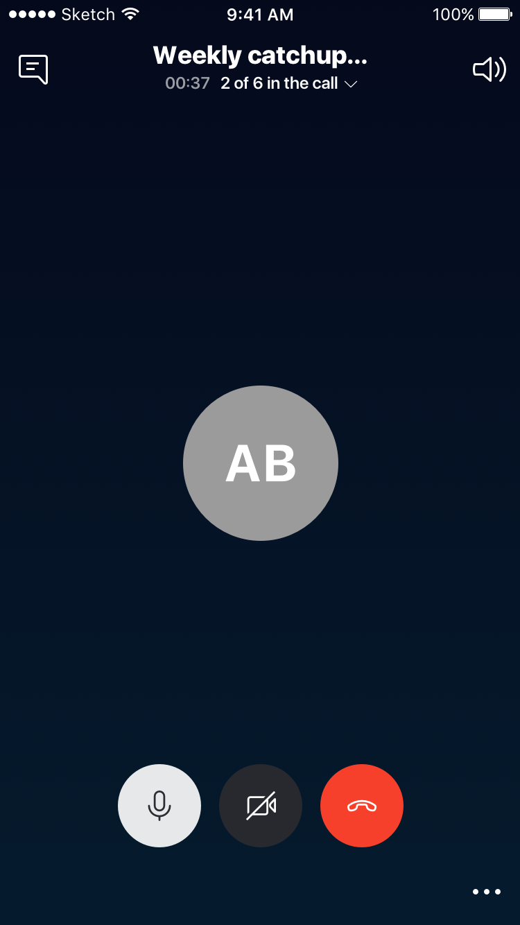
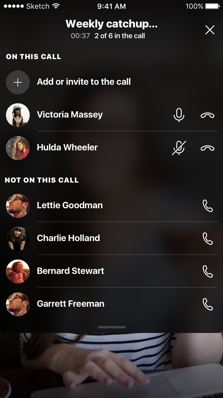
Final design:
User testing - iteration 1
People were struggling with the basics:
Turning video on/off
Muting/unmuting microphone
It was too confusing to have two sets of controls - people want a clear immersive view with no controls, then a single view with controls - no need to worry about which set of controls you need to mute or hang up etc.
Iteration 2
Goals:
Simply and fix the fundamentals (keep iterating on what has been learnt so far).
Trade off in immediate access to everything in order to afford clearer hierarchy (e.g. ‘react‘ is under a menu, which is slower to access but easy to learn).
Create space and clarity for exploring enhancement functionality (e.g. reactions, effects, snapshots, recording, subtitles), without risking disorientating the user for the core call controls.
Stabilize customer engagement & regain trust!
User testing - iteration 2
Immediately perceived improvement with the basics:
No more problems muting/unmuting or toggling video on/on.
However:
People were still looking for a clearer action for swapping camera.
As anticipated, access and discovery for growth/experimental features like reacting and snapshot suffer if not immediately available.
Additionally we noted in internal dogfood usage over time that chatting during calls on mobile increased by 20% after this iteration update.
Outcomes and learnings
The redesign iteration(s) helped stabilize user engagement.
While not significantly attracting new users, the existing users remain loyal and engaged (despite Microsoft’s focus on Teams, Skype still has around 300 million active users with >40 million people using it daily).
Update March 2025 - Microsoft announced the discontinuation of Skype
When faced with the decision to prioritize growth and experiments vs usability fundamentals, it was clear that without a robust and usable foundation, there will eventually be nothing to experiment on top of.
This experience highlighted the value of user testing and validation to mitigate risk in adding (or replacing learn behavior with) new features and interaction patterns.
When faced with losing loyal customers at the expense of pivoting to appeal to a different/new market segment, it turned out that the risk of alienating existing users is higher - existing users will leave faster than losing potential new users.


